Project Description:
Design Applicant Tracking System (ATS), which is part of Human Resource Information System and is customized for large workforce, high hiring load, extremely fast and flexible staffing.
Team:
Project Manager, UX Designer, team of full-stack developers, Salesforce administrator.
Status:
As of mid-2018, defined requirements and completed design for most of phase 1 scope. Project is still in progress.
Tools:
Sketch
InVision
Zeplin
OmniGraffle
Solution:
Elaborated scope, created requirements and designed Applicant Tracking System, which includes dashboards, position requests, requisitions, job posting, interview pipelines and other product sections.
Opportunity:
Internal project for an industry leading company, with thousands of employees across multiple departments. Human resource scale requires custom staffing solution incorporating specific industry needs, high hiring load and flexible system.
Fast hiring is crucial, therefore product and user experience design of Applicant Tracking System becomes extremely important.
My role:
Initial Product Management: product kicked off without staffed PM, which was an opportunity for me to step in and cover product definition, gathering requirements, scoping and phasing. Later, transferred knowledge to new Product Manager.
Research: market research, competitor/comparative analysis, user interviews, contextual inquiry.
User Experience: wireframing, prototyping, usability testing, educating team about UX.
Visual design, working hand in hand with developers to ensure my design is feasible for implementation.
Interface icons: selected and purchased icon sets to save design time, developed several missing icons.
Style guide: created platform style guide as part of ATS design. It required extra work beyond ATS scope, but made whole platform UI much more appealing.
Market research and product scoping
Product mindmap
Before doing any work, designer should ask what do you want to build and why. We did not have Product Manager at the moment, so I performed market research, compared existing solutions and learned about business space in general. Meanwhile, I identified project stakeholders, talked to them to gather requirements and expectations, identified affinities and built product mindmap.
Eventually, mindmap became a leading input to information architecture, wireframes and scope management in general. Certain diagram leaves are linked to product user stories.
Mindmap, enlarged section. Individual leaves are linked to user stories.
Wireframes, prototyping and usability testing
I defined major screens, transitions between them, sketched dashboard and requisition flows, then created wireframes and organized them into prototypes. Each of these steps is followed by formal and informal usability tests, which in turn results in further iterations improving final design.
Clickable prototype used for a few usability tests: link.
Interesting comparison of original wireframe version vs final design:
Early wireframe
Final high-fidelity version
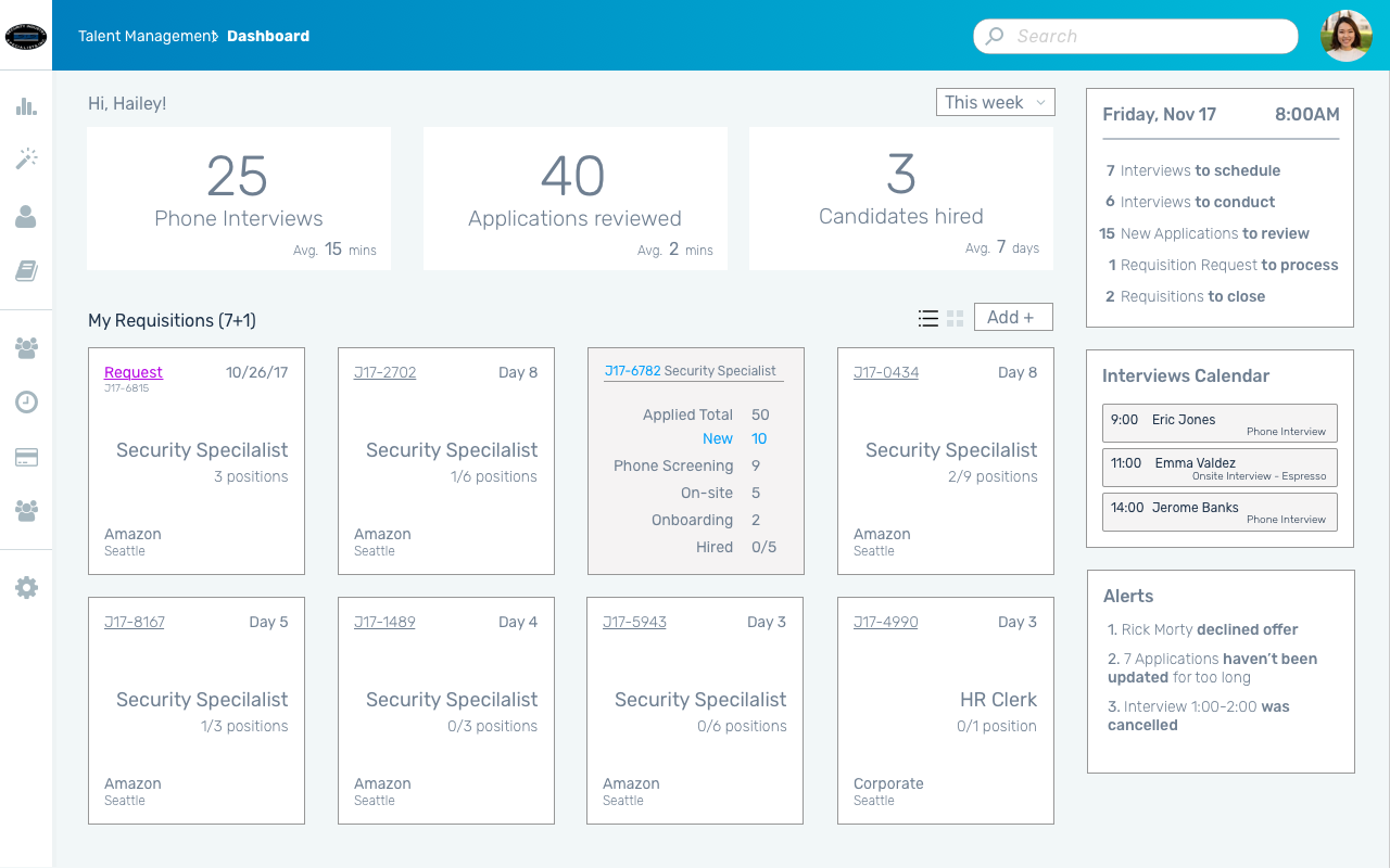
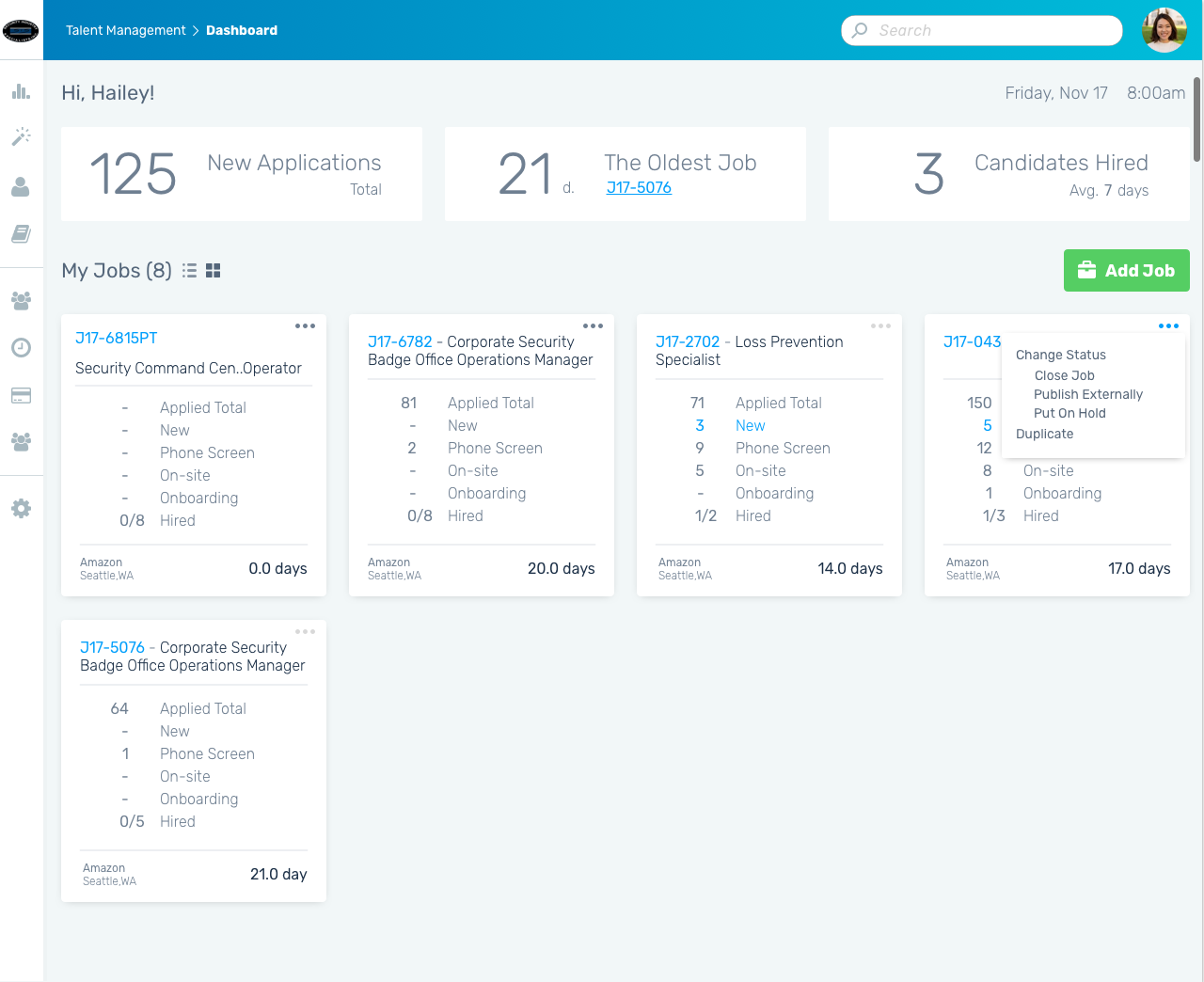
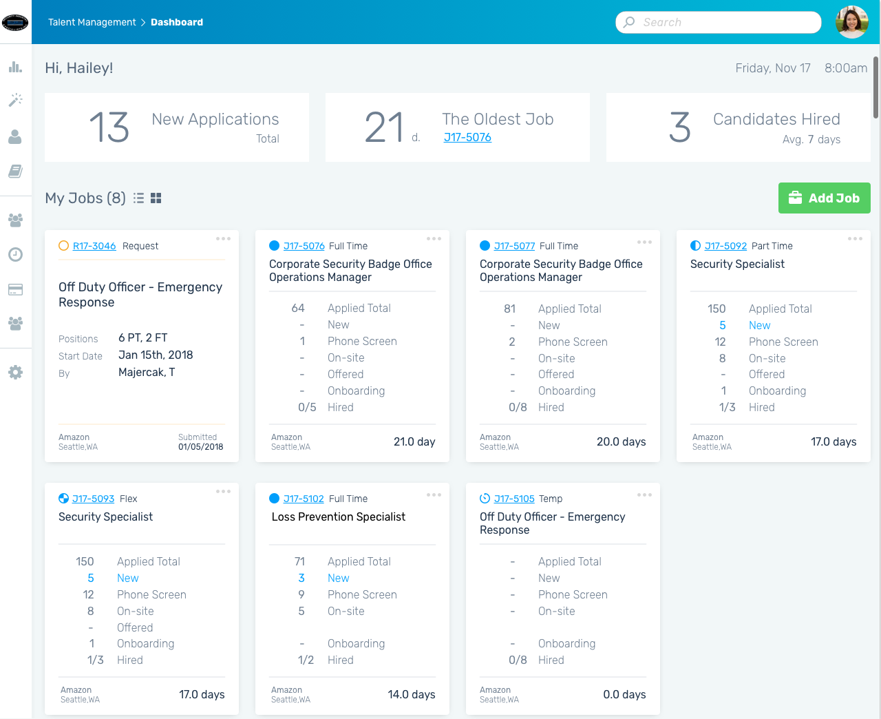
Dashboard design iterations


High-fidelity design
I created more than 150 hi-fi designs for ATS screens and versions. Sample of final results:
Position shifts schedule
Internal job board
Offer screen


